Date: September 2014
Client: The Lassy Project
Categories: Wireframing, Interaction Design, Mobile App
I was part of a rotating cast of designers working on The Lassy Project, a mobile app and accompanying web app whose purpose is to find missing children faster. Of all the projects I have worked on, this is one I can confidently say is changing, or saving, lives. When a child goes missing, time is extremely important, so the apps must be be very easy to use quickly and under distress.
Wireframes
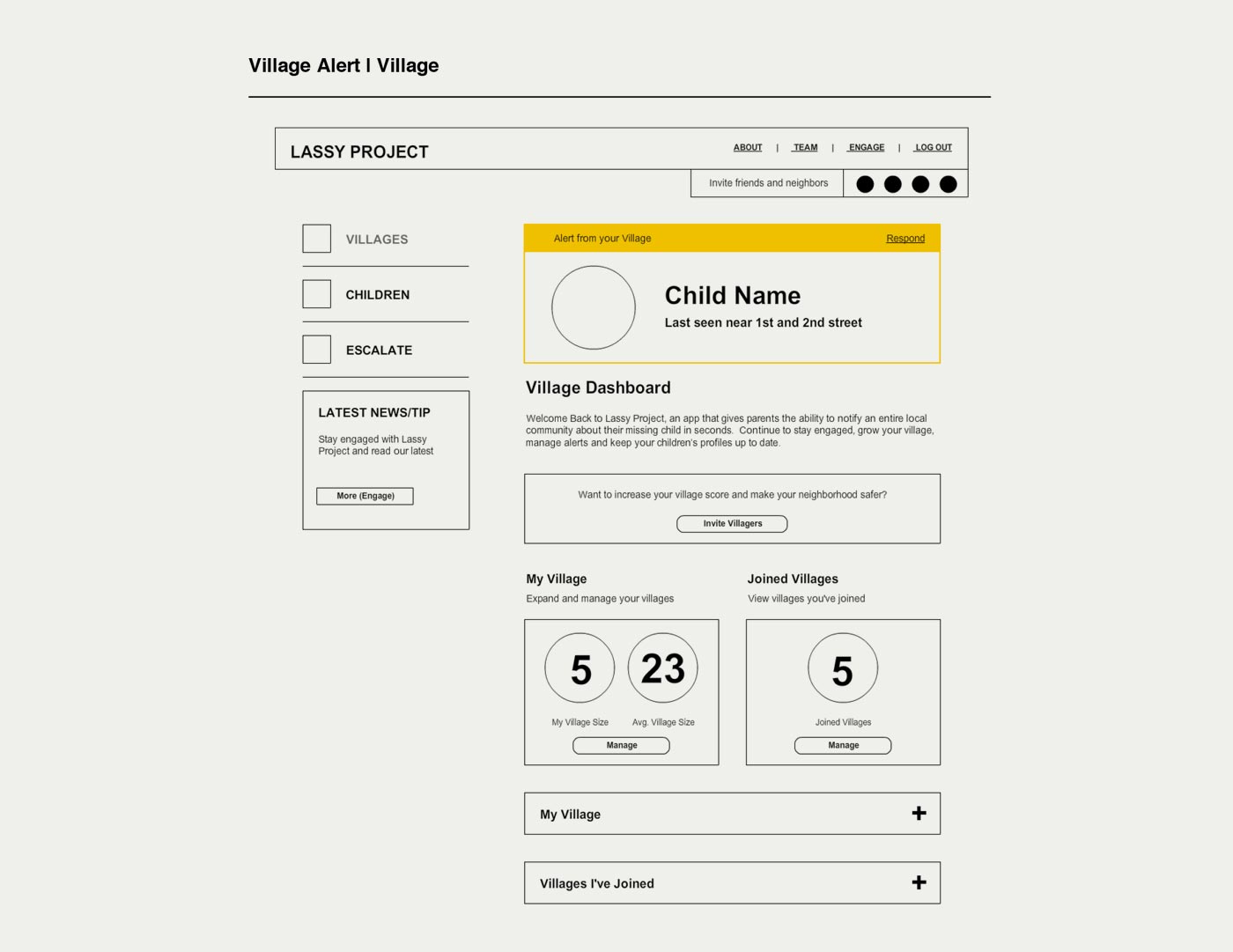
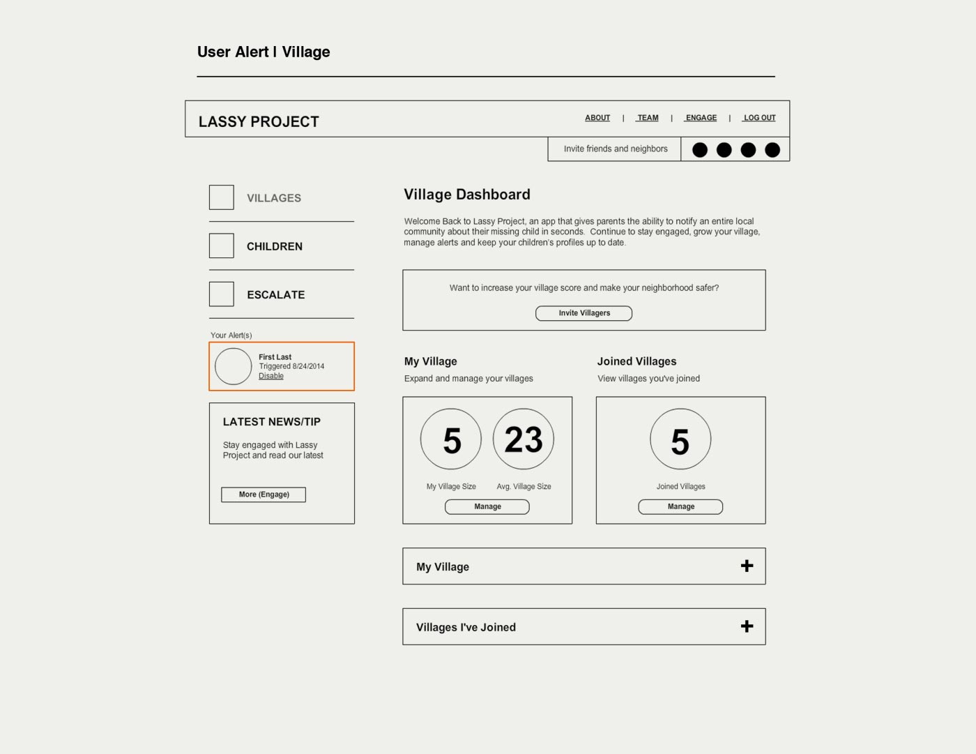
Because of the unique feature of submitting alerts and responding to alerts of missing children, I insisted we begin by wireframing those actions, which are essentially the purpose of the whole application.
Mobile Experience
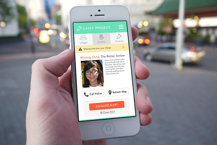
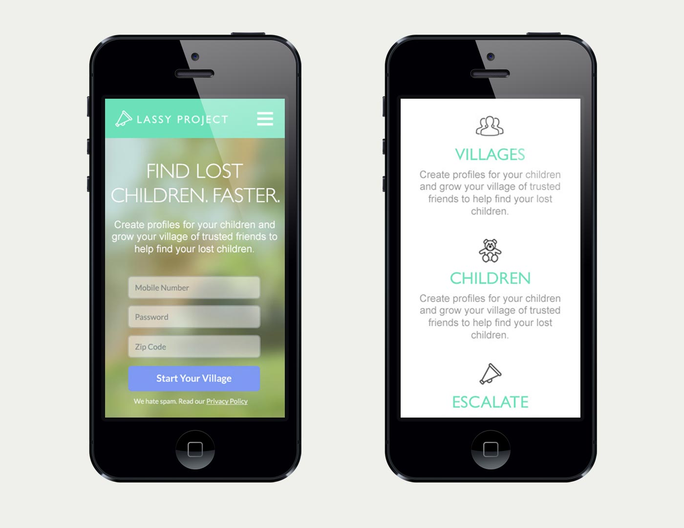
The ability to quickly notify your network the moment you notice your child is missing, from a park or school made a good case to begin this project in the “mobile first” attitude. The mobile apps were developed first, followed by the responsive website app. The majority of use comes from mobile devices, which made me consider the value of developing the desktop app at all. But that wasn’t my call in the end, so we built it anyway.
Creating An Alert
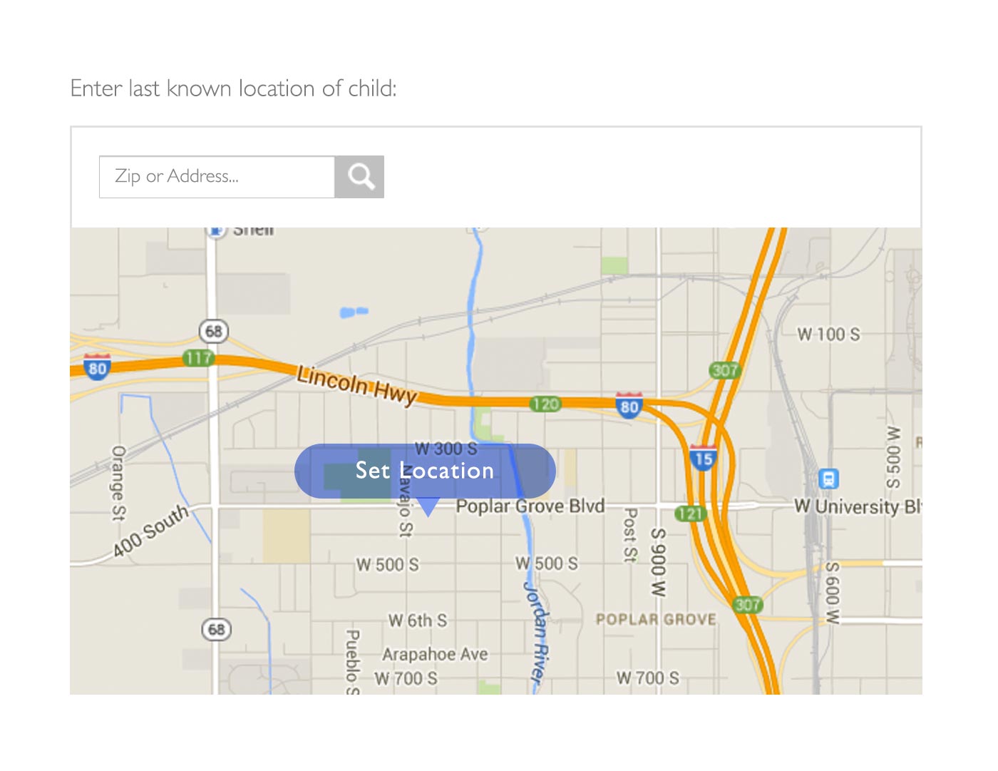
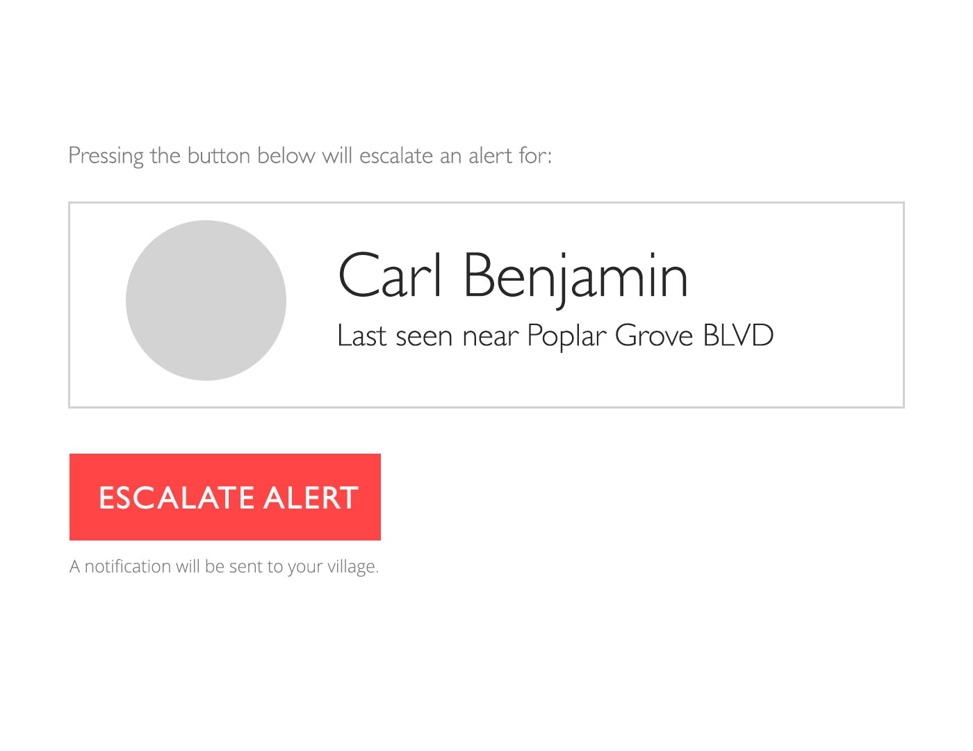
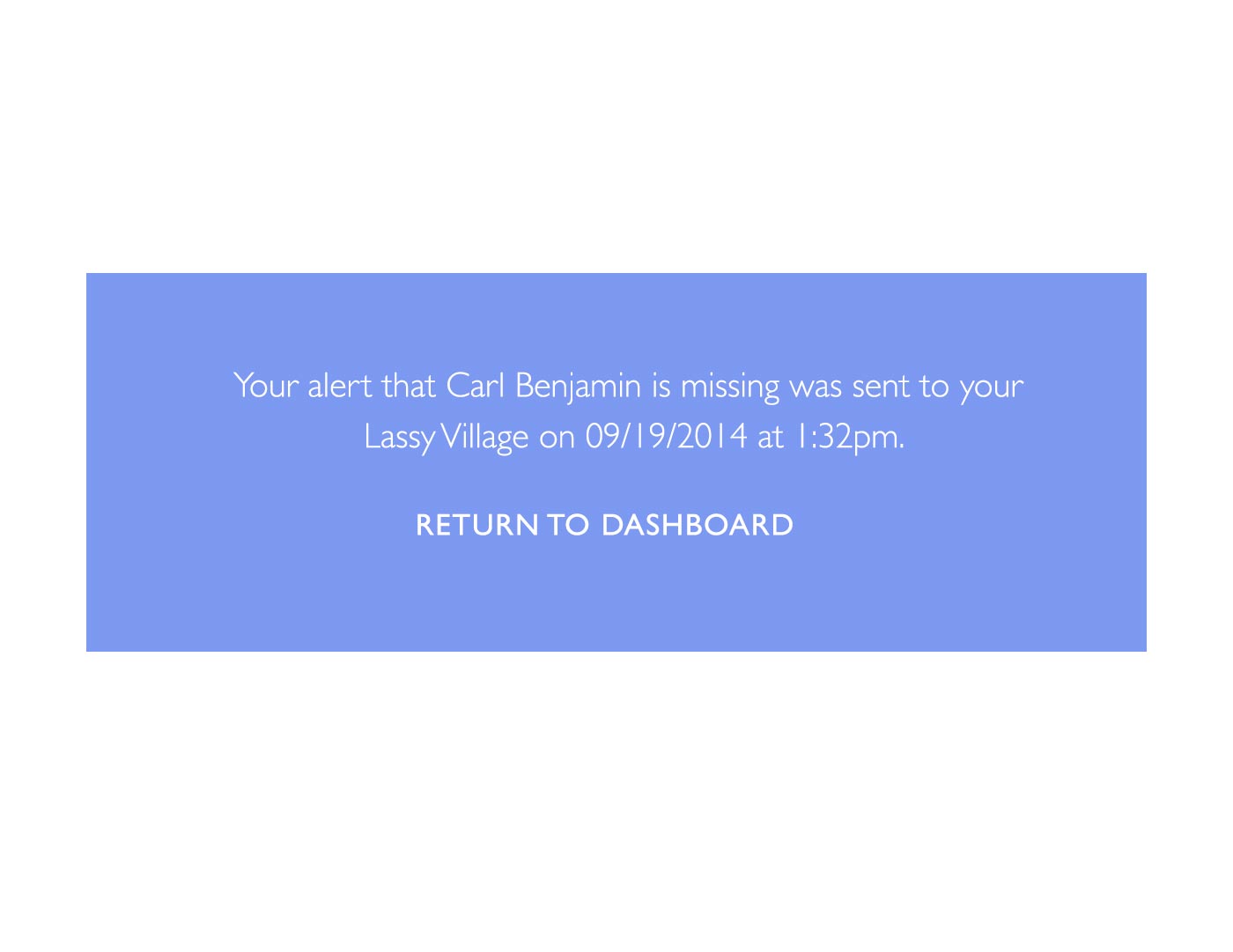
We wanted it to be quick and easy for parents to submit an alert for a missing child to their village (network of friends and neighbors), especially under stressful circumstances. The final process includes 2 easy steps to provide essential information about the child and a final step to confirm the alert.

Ease of Use
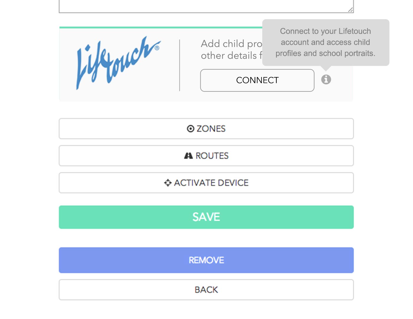
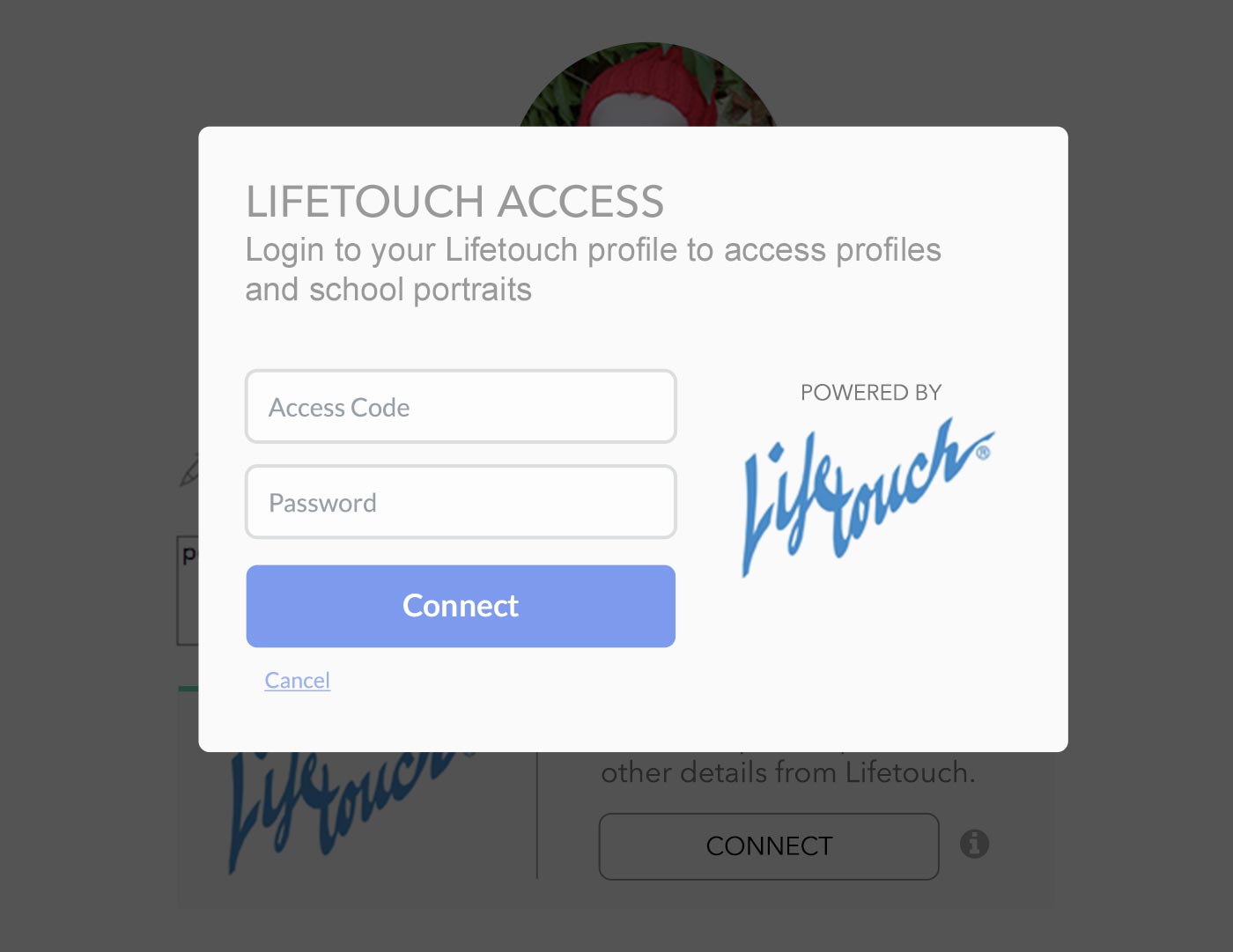
During the process of creating the app, the founders of The Lassy Project were able to negotiate a meeting with Lifetouch, the largest provider of school photos. This meant that users would be able to use their Lifetouch login to access latest photos for their children. This also meant we needed a seamless experience to connect via Lifetouch.
