Date: April 2015
Client: Sling TV
Categories: Benchmarking, Prototype, Usability Testing
The first version of Sling TV was released quickly and we had sufficient feedback combined with general internal knowledge that it was hard to navigate and find programs.
Hypothesis: The alternate layout would improve performance and search time.
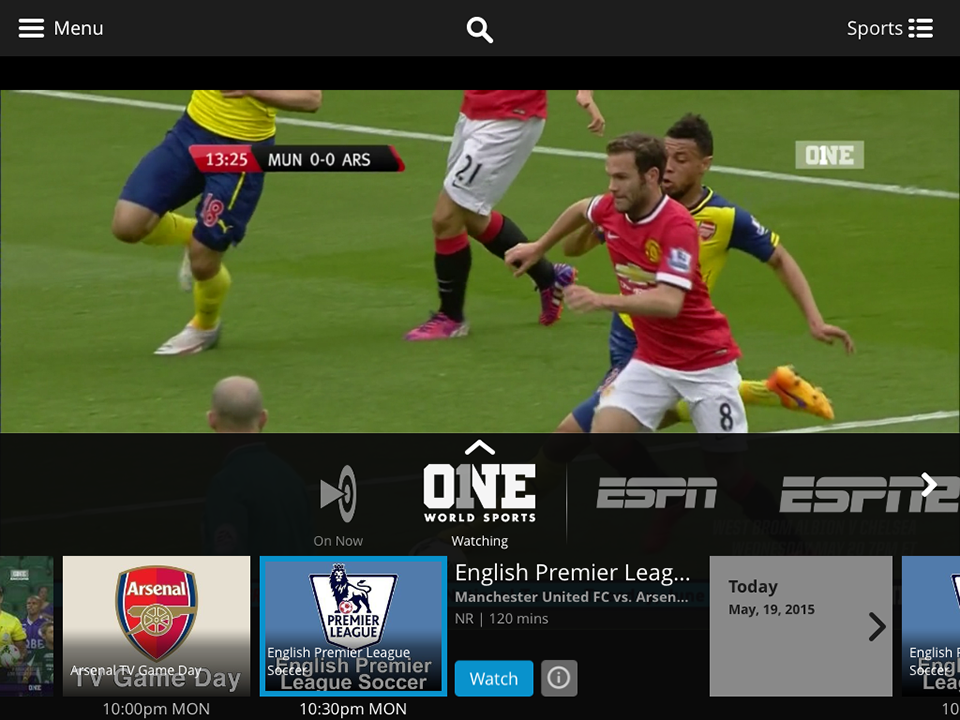
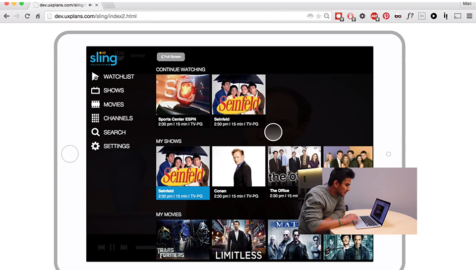
The original Sling TV layout.
Competitive Benchmarking
The original release of Sling TV began playing a channel immediately and there was no way to pause a program due to contractual obligations. To select another program the user had to navigate a ribbon overlaying the video. This autoplay paradigm follows analog television conventions and would prove to be a fundamental point of dispute internally. The UX team believed our competitors to be Netflix, Hulu and Amazon Prime, not other cable providers. An audit of Netflix, Hulu and Amazon Prime players showed that they all provide the browse before play paradigm. They also incorporated a hover or click for more information before revealing a clear call to play the content.


To see more benchmarking examples, visit the UXdb.
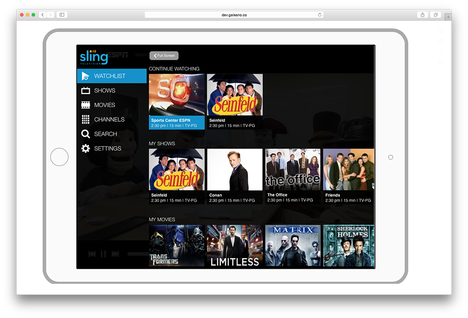
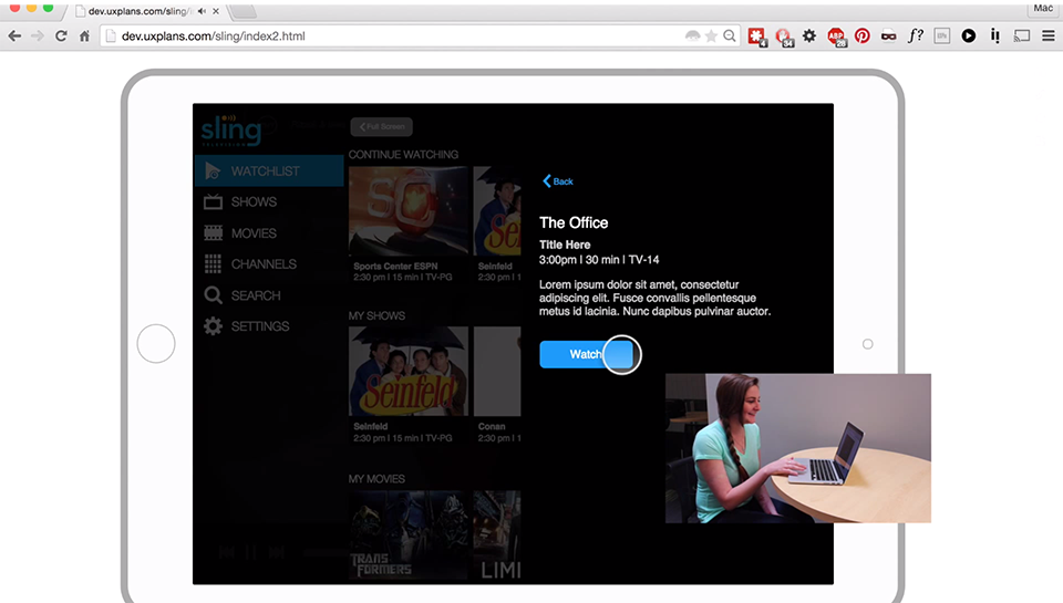
Proto.io
We began with a new layout that accounted for the browse first paradigm. We created comprehensive screens with InVision that we could click through but the fidelity was not high enough to test on real users. After researching several programs, I decided to give Proto.io a shot. It took several weeks of dedicated time and patience but I finally re-created our new layout in Proto.io and we were ready to put it in front of users.
To see more prototype examples, visit the UXdb.
Task List
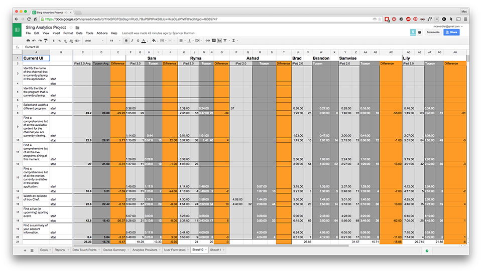
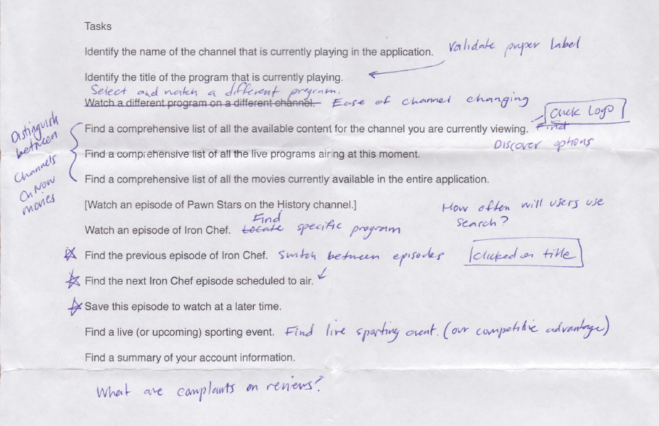
I listed the assumptions I had and designed specific tasks that would validate or disprove those assumptions. After several revisions, I had a task list of roughly 10 questions
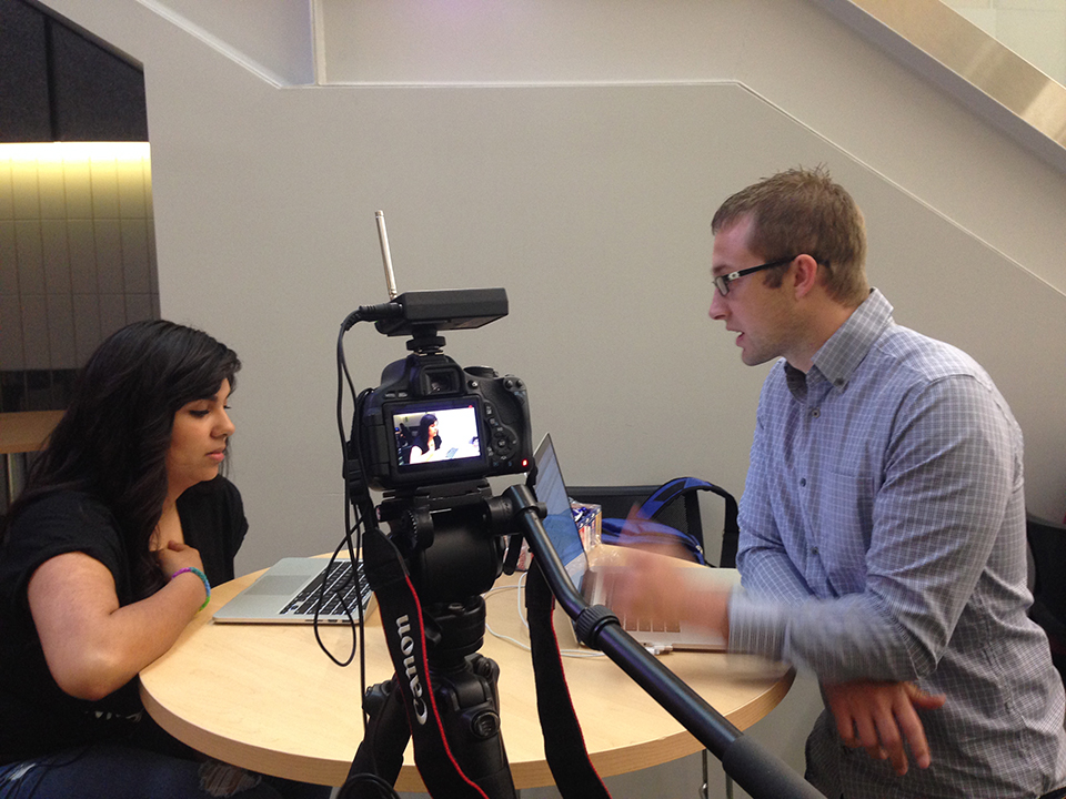
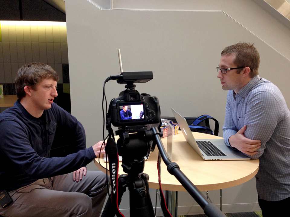
UVU
I headed to UVU campus with the UX Researcher and a box of candy bars. We set up in the student center and talked to everyone with ten minutes to spare. Half of the subjects performed the task list on the live app first. The other half performed the same tasks on the prototype. Each group then performed the same tasks on the opposing platform.
Initial Findings
Our hypothesis was correct in almost every aspect. Users completed almost every task significantly faster on the prototype. Those users that tested the prototype first, took longer to complete the tasks on the live app.
- Users completed tasks 57% faster on the prototype than the same tasks on the live application.
- Users switched programs 146% faster on the prototype.
- Users found the movie list 236% faster on the prototype.
- Users found live sporting events 160% faster on the prototype.